
For more than a decade, Turkish football clubs were bound by an unusual regulation imposed by the Turkish Football Federation (TFF) — a mandatory use of the Arial font on all official team jerseys. Now, with the TFF’s recent decision to lift this restriction, clubs have been granted long-awaited creative freedom. But how did a billion-dollar football industry come to rely on such a generic typeface? The answer lies deep within a historical battle of corporate strategy, licensing wars, and overlooked design philosophy.
Why Arial Became the Default
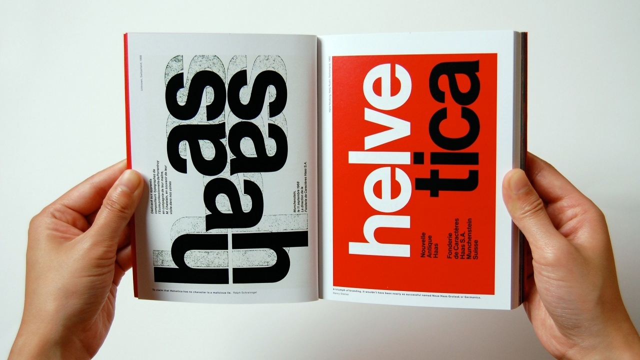
The roots of this story go back to 1957 in Switzerland, when designer Max Miedinger created Helvetica — a font so clean, modern, and readable that it became the darling of the design world. From subways in New York to the branding of giants like Toyota and Panasonic, Helvetica dominated the landscape.
But in the 1980s, as Microsoft and IBM began shaping the digital future, Helvetica’s licensing costs presented a problem. Enter Monotype, which developed a nearly identical font — Arial — designed to mimic Helvetica’s metrics but without its licensing baggage. Microsoft adopted it across Windows, catapulting Arial into global ubiquity.
While Helvetica became a symbol of timeless modernism, Arial was often seen as a cheaper, soulless imitation — a workhorse without elegance, used in resumes, spreadsheets, and bureaucratic documents. Yet, thanks to its accessibility and zero-cost licensing, Arial became the pragmatic choice for organizations worldwide — including the TFF.
The Font That Haunted Turkish Jerseys
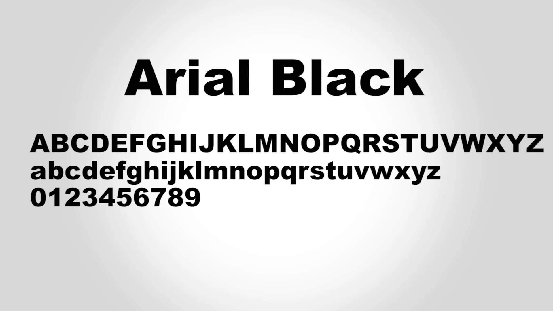
When the TFF mandated Arial font usage in the 2013–2014 season, the rationale was clear: cost-efficiency, consistency, and readability for referees and broadcasters. Arial was everywhere, installed by default on every system. It worked. It was safe. But it was also uninspired.
Unlike global leagues such as the Premier League or La Liga — both of which have developed distinctive branding, including custom typefaces for their kits — Turkish football settled for the easiest option. For over a decade, every jersey looked eerily similar, stripped of unique identity. Fans called it “soulless.” Designers shunned it. Clubs lacked typographic individuality.
Typography Matters More Than You Think
Fonts aren’t just about aesthetics. They shape perception. Serif fonts like Times New Roman evoke tradition and formality. Sans-serif fonts like Helvetica signal clarity and modernism. Arial, unfortunately, signals indifference.
Brand psychology plays a huge role in how fans perceive their teams. Typography, like logos or colors, becomes part of a club’s DNA. By forcing Arial, the TFF unintentionally stifled brand evolution in Turkish football.
More Than Just a Font Change
Lifting the Arial ban isn’t merely a cosmetic shift. It symbolizes a broader awakening — a long-overdue recognition that sports branding matters. That Turkish football, with its immense heritage and passionate fan base, deserves the same visual storytelling seen across Europe.
However, as important as this decision is, it also exposes a missed opportunity. Thirteen years passed before this course correction, years during which no national effort was made to craft a unique visual identity for the Süper Lig. While other leagues partnered with top-tier designers to build cohesive, marketable aesthetics, Turkish football lagged behind.
A New Era for Turkish Football Design
With Arial finally out of the picture, Turkish clubs now face a blank canvas — and a challenge. Will they revert to arbitrary font choices, or will this moment spark collaboration with local designers and brand experts to define something truly original?
Creating a league-wide typeface could boost the Süper Lig’s commercial appeal, unite clubs under a shared visual language, and allow individual teams to express themselves within that system. It’s not just about form — it’s about storytelling, identity, and connection.
A Symbol of Progress
This policy reversal may seem minor in the grand scheme of sports governance, but it reflects something deeper — a shift towards modern thinking, creative autonomy, and aesthetic sophistication in Turkish football. For years, clubs were forced to wear jerseys that spoke with someone else’s voice. Now, they can speak in their own.
As fans, designers, and players alike rejoice, the hope is that this moment marks the beginning of a more brand-conscious, expressive, and globally competitive era for the Süper Lig.